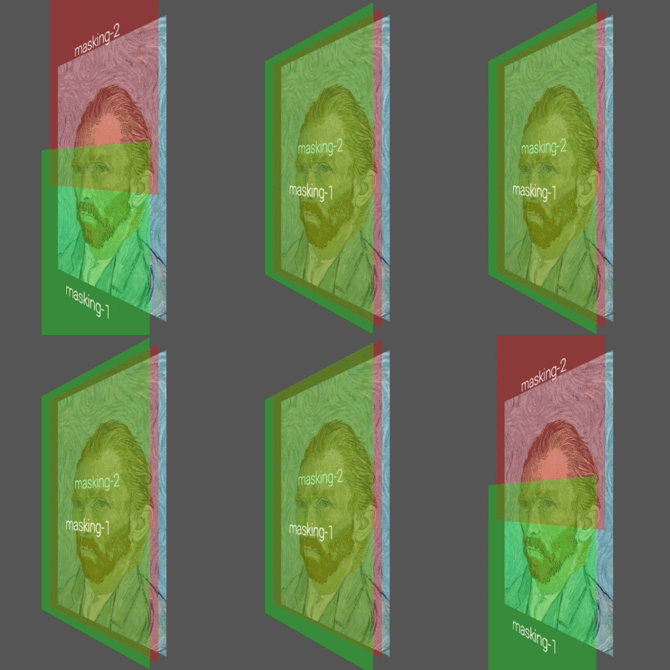
If you want to make a masking animation on HTML, usually can make using height transition and overflow: hidden.
It’s fine on your desktop browser, but it’s not smooth on mobile devices.
The performance of animating some elements (such as width, height, left, top and margin..etc) are not that great on mobile devices.
The best things for smooth animation are CSS3 transitions, CSS3 3D transforms, Canvas Drawing and WebGL, because these things are using GPU acceleration.
I’ve tested three ways (Height, ScaleY, Translate) for smooth animations, you can see my demo at below url.
http://lab.cmiscm.com/masking/
1. Height animation
It’s very simple way for the masking animation.
But the performance is bad on mobile devices, the animation is not smooth.

2. Scale animation
So what about using scaleY for the masking animation.
The performance is good, but the image is stretched little bit while animating.

3. Translate animation
Actually this is what I want to say at this article.
It only uses CSS transitions with two masking layers, and it’s super smooth on mobile devices.

