T-SHIRT DESIGN
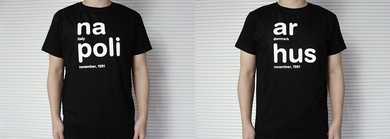
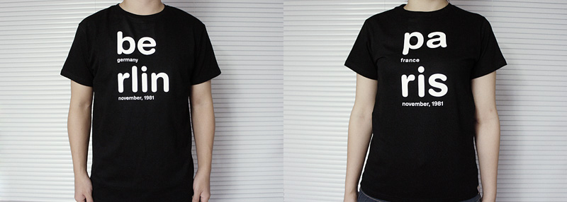
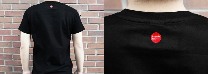
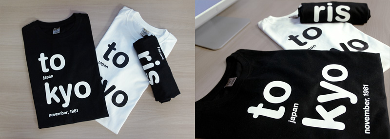
FRONT & BACK
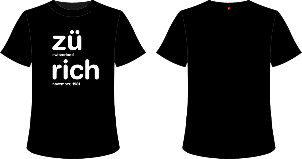
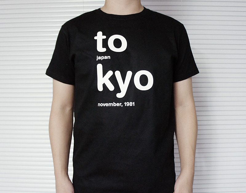
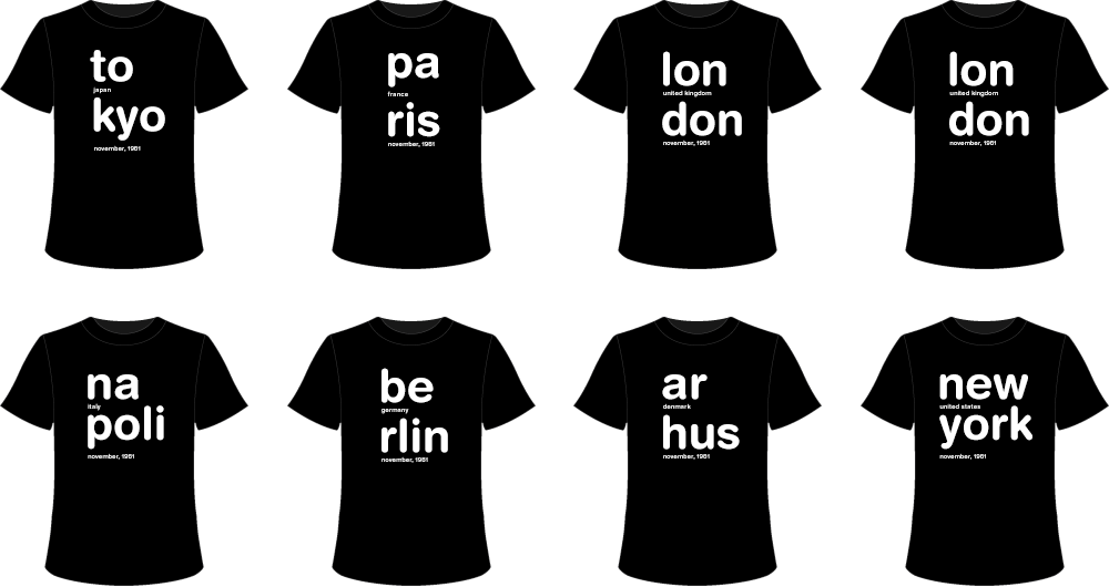
BLACK COLOR
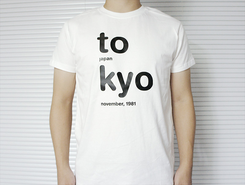
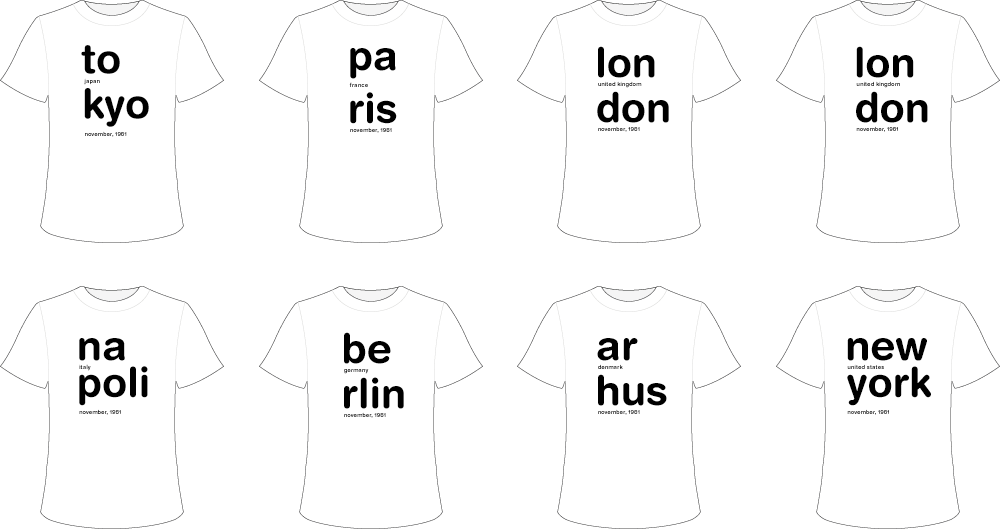
WHITE COLOR
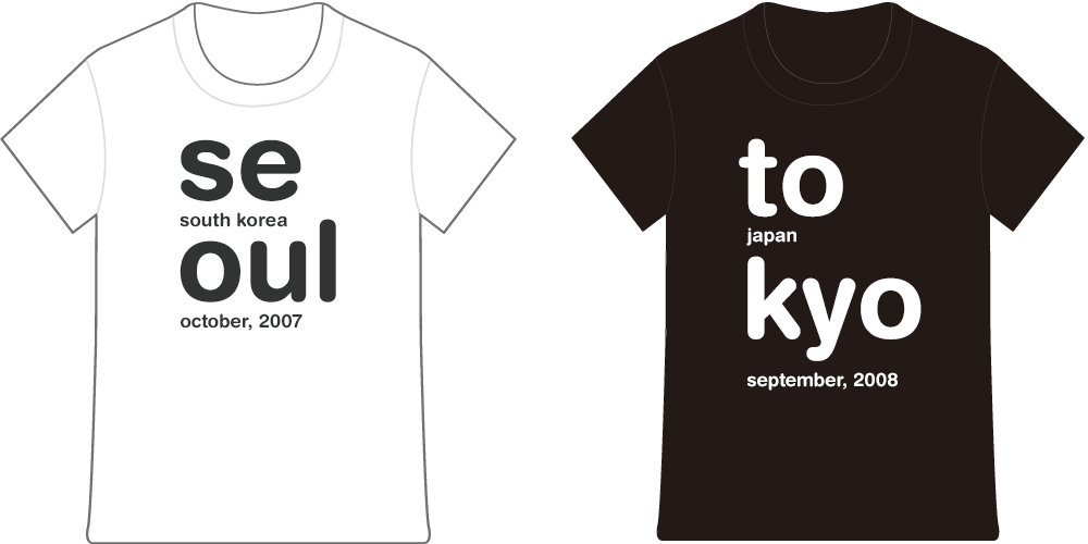
MAP TYPE DESIGN

CONCEPT DESIGN
DESCRIPTION
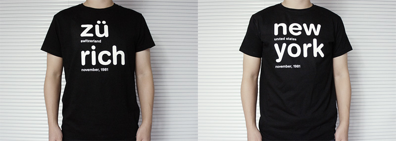
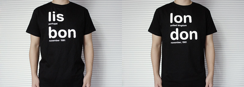
If you pronounce the words, it divides into syllables, I classified these syllables and organized the words up and down. For example, word ‘Paris’, pronunciation divides in to (Pa)/(ris), by placing up and down. I made a familiar word to awkward and gave a visually freshness and design effect.
ROLE
- Solo work